
Introduction
The continually expanding population on Earth is a vital factor to consider, and understanding the spatial distribution of this population plays a critical role in numerous policy decisions.
This is why the interdisciplinary applied research group WorldPop diligently monitors the spatial distribution of the global human population and freely provides the respective geospatial population data. The group specialises in producing peer-reviewed research and methods for creating open, high-resolution geospatial data on population distribution, demography, and dynamics.
In this blog post, we will work with data containing the estimated population density in the United States. The data can be accessed directly from this webpage. It is provided as grid data, where every observation refers to an area of 30 arc seconds squared.1 Consequently, one observation roughly covers 0.86 km2 at the equator, 0.77 km2 in Miami, but merely 0.57 km2 in Seattle. The population density information in the data set is expressed in residents per square kilometer.
1 The area that each observation refers to does not generally have the same height and width. 30 arc seconds of the polar circumference have a constant height, but 30 arc seconds on the circumference at a specific latitude do not have a constant width.  Thus, one observation relates to a square only at the equator. The observations become less of a square the closer they lie to the poles.
This blog post is divided into three sections: In section 2, we will explore the process of loading and preparing the population density data, as well as collecting supplementary data from the internet. In section 3, we’ll utilize the acquired data to create a high-quality map. Lastly, in section 4, we will perform various calculations on the data.
To execute the R code presented in this blog post, the following packages must be enabled:
library(raster)
library(animation)
library(geodata)
library(magrittr)
Preparing the data
In the initial phase, we will prepare several data sets to produce an aesthetically pleasing map. Specifically, we aim to prepare population density data, information about state borders, and details about city names, coordinates, and size.
Read the population density data
In a first step, we’ll load the data and create a subset centered around the contiguous United States, which includes the 48 contiguous states but excludes Alaska, Hawaii, Puerto Rico, and other overseas U.S. territories (1).
data <- read.csv("USA_2020.csv")
data <- with(data, data[X > -126 & X < -66 & Y > 25 & Y < 50,])- 1
-
Load the data from the downloaded CSV-file
USA_2020.csv. - 2
-
Subset the data based on longitude (
X) and latitude (Y).
When designing a population map based on population per square kilometer, the color key would struggle to handle the extremely wide range of the population density: some regions are virtually uninhabited, while others have more than 5000 residents per square kilometer. So, let’s create an additional variable named logZ, which encompasses the common logarithm of the estimated population density. We also set any value below zero (that is a population density below one resident per square kilometer) to zero in order to further reduce the range of the variable logZ.
data$logZ <- log10(data$Z)
data$logZ[data$logZ<0] <- 0
Now, we may create a raster object from the data. This makes it easier to visualize the content – we can use the R package raster.
raster <- raster::rasterFromXYZ(data[,c("X", "Y", "logZ")])Here, we select the newly created variable logZ as the variable containing population information. However, you may also use the original Z for this purpose and see how it affects the map.
Scraping coordinates and names or largest cities
Besides the population density data, we’d maybe like to label the largest cities in the United States. We can scrape corresponding data from this website.
"https://www.tageo.com/index-e-us-cities-US.htm" %>%
rvest::read_html() %>%
rvest::html_nodes("table") %>%
rvest::html_table(fill = TRUE) -> content
cities <- data.frame(content[[14]][-1,])
colnames(cities) <- content[[14]][1,]
for (i in 3:5) cities[,i] <- as.numeric(cities[,i])- 1
- Download the entire content of the specified webpage.
- 2
- Select the right table from the entire scarped content of the website. In this case, it happens to be the 14th item in the list.
- 3
-
Change the type of the variables in
citiesto numeric, if needed.
Getting information about state borders
The R package raster supplies information about U.S. state borders, which we will store as an object called states for future use. We will continue to exclude the states of Alaska and Hawaii from our analysis, which can be achieved by simple sub-setting.
states <- getData("GADM", country = "USA", level = 1)
states <- States[states$NAME_1!="Alaska"&states$NAME_1!="Hawaii",]
At this point, we have gathered all the necessary data required to create the desired map.
Creating a population density map
To create the map, we can conveniently utilise the plot.raster function from the R package raster. This provides us with the benefit of a pre-defined legend for color coding. Incorporating state borders is a straightforward task as well. Finally, we can add city labels using a simple for-loop.
png("USA.png", width = 16, height = 8, res = 200, unit = "in")
plot(raster, asp = 1.25, maxpixels = 1e10, box = FALSE, axes = FALSE)
plot(states, add = TRUE)
for (i in 1:50) {
points(x = cities[i,"X"], y = cities[i,"Y"])
text(x = cities[i,"X"],
y = cities[i,"Y"],
labels = tools::toTitleCase(cities[i,"Name"]),
pos = 3, xpd = NA, font = 2)
}
dev.off()- 1
-
Generate a new file called
USA.png. You can customise the width and height of the PNG, as well as set your desired resolution. - 2
-
Plot the raster object
raster. Be aware that there is a default limit of 100’000 for the maximum number of pixels to be visualized. To increase this number, you will need to set themaxpixelsargument to a higher value. You can also pass a custom color palette via the argumentcol. - 3
- Incorporate the state borders into the map. Please note that this step may take some time, as the downloaded state borders are exceptionally detailed.
- 4
- Incorporate the cities into the map by initially adding them as points, followed by including their respective labels.
Following these steps, you should obtain a map resembling the one shown below. Naturally, you can customize your map further by introducing your own color palette or incorporating additional features, such as variable label positions for city names, or variable sizes of the city center marks.
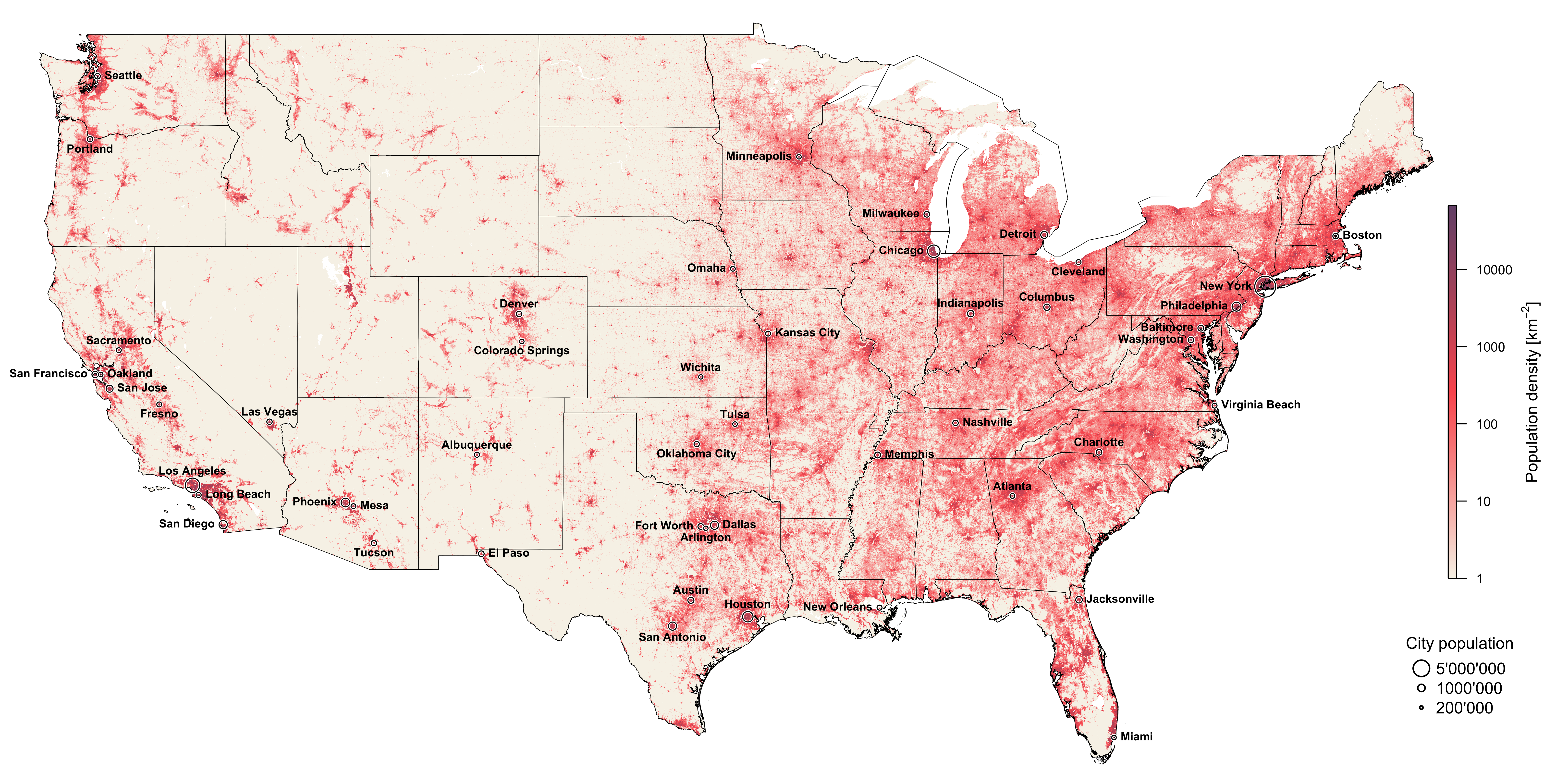

The map provides a compelling visual representation of population distribution across the United States. Several fascinating insights can be gleaned from this map, including the identification of the most densely populated areas. These high-density regions stand out clearly and offer a bird’s eye view of the urban centres where most economic and social activities take place.
One of the most striking features of the map is the visibility of certain population patterns. For example, the Appalachian Mountains emerge as an unpopulated region, illustrating the role of geographic barriers in influencing settlement patterns. The mountains not only represent a natural boundary but also highlight the disparities in population density that can arise from varying landscape characteristics.
Another intriguing observation is the manner in which population distribution follows the road networks in several states, for example in Iowa. The grid pattern on the population map suggests a close relationship between infrastructure development and human settlement. As people gravitate towards well-connected areas, they contribute to the emergence of population clusters that follow the layout of road systems.
The map also underscores the stark contrast in population density between the eastern and western United States. The eastern region, with its bustling cities and long-established settlements, is markedly more populated than the west. This disparity may be attributed to several factors, including differences in landscape and climate, such as the arid conditions in the western deserts that make the area less hospitable for large-scale settlement. But the history of U.S. colonisation also plays a significant role in shaping this pattern. As settlers moved from east to west, they established communities and developed the land along their journey. California stands out as a unique example, having experienced population growth from both west to east and east to west. This phenomenon can be attributed to the California Gold Rush, which attracted settlers from multiple directions and contributed to its rapid development (3).
In summary, the map offers a captivating overview of the population distribution in the United States, revealing intriguing patterns and highlighting the factors that have shaped human settlement.
A closer look at the geospatial data
In this segment, we will delve deeper into the specifics of our geospatial data. We may decide to divide this data into two distinctive portions based on geographical orientation: the western (“West”) and the eastern (“East”) parts of the contiguous United States. To accomplish this, we adopt the 100° longitude meridian line as the splitting boundary, which, conveniently, offers a near equal partition.2 Thus, all the land in the contiguous United States positioned west of this meridian line falls into one category, while the land eastward forms another.
2 The contiguous United States may be split into two by the 100° longitude meridian line.
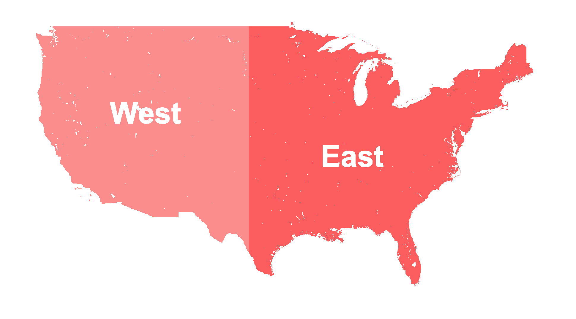
Visually, both sections appear to be approximately equal in size.
To effectuate this split, we can introduce a factor variable to the data frame data by creating a logical vector rooted in the unique values of the longitude (X).
data$Side <- factor(data$X >= -100, labels = c("West","East"))Subsequently, we calculate the total population within each of these demarcated regions. However, it’s important to remember that a single observation doesn’t necessarily equate to the same surface area at every given point – as established in section 1. As such, we need to ascertain the exact area for each observation in our data frame. Our aim is to achieve a more accurate calculation than the one used initially, which presumed the Earth as a perfect sphere.
Instead, we now consider the Earth as an ellipsoid, as defined by the World Geodetic System (WGS), specifically its latest iteration, the WGS84 (4). As an ellipsoid, the WGS84 has two radii: an equatorial radius (a = 6’378’137 m) and a polar radius (b = 6’356’752 m). Employing these two values, we can formulate the Earth’s circumference C as a function of the latitude \varphi in radians.3
3 Since we are dealing with the latitude (L) in degrees, we transform it to radians as: \varphi = \frac{L \times\pi}{180} Note that L ranges from -90° (south pole) to +90° (north pole).
C(\varphi) = \frac{2 \pi a \cos(\varphi)}{\sqrt{1 - \frac{a^2 - b^2}{a^2} \sin^2(\varphi)}} \tag{1} Once we have the specific circumference for a particular latitude calculated, it becomes straightforward to determine the size of a single pixel. A(\varphi) = \frac{C(\varphi) \times C_{\text{polar}} \times \gamma^2}{ \left( 360 \times 60 \times 60 \right)^2} \tag{2}
Here, \gamma represents the number of arc seconds that a single pixel encompasses (\gamma = 30), while C_{\text{polar}} is the polar circumference (C_{\text{polar}} = 40007.9).4 This essentially translates to one pixel covering roughly one square kilometer around the equator.
4 The circumference of an ellipse, which the WGS86 polar circumference is, can be expressed as follows: C_{\text{polar}} \approx \pi \left(a+b\right)\left(1+{\frac {3h}{10+{\sqrt {4-3h}}}}\right) where a and b are the equatorial and polar radii, respectively, and h is a substitute for \frac{(a-b)^2}{(a+b)^2}.
Now, let’s bring this theory to life with some coding! Our goal is to compute the area of both the "West" and "East" subsets of the data. To do this, we’ll first define a function named getArea. This function will return the area covered by a single observation given the latitude of this observation.
getArea <- function(latitude, a = 6378.137, b = 6356.752, gamma = 30) {
   h <- (a - b)^2/(a + b)^2
   C_polar <- pi * (a + b)*(1 + (3 * h/(10 + sqrt(4 - 3*h))))
   phi <- (latitude*pi)/180
   C <- 2*pi*a*cos(phi)*(1-(a^2-b^2)/a^2*sin(phi)^2)^(-1/2)
   C * C_polar * gamma^2 * (360*60*60)^-2
}
We can then apply this function to every observation in our data frame data effortlessly, since all operations in getArea are applicable to vectors, not only single values.
data$Area <- getArea(data$Y)Once this is done, we are prepared to compute the total area, along with the total population for each side.
Area <- with(data, tapply(Area, Side, sum))
Population <- with(data, tapply(Z*Area, Side, sum))
We can even derive the population density for each side separately.
Population/AreaA complete summary of the calculation results is displayed in table 1. It’s important to note at this point that the value for the total population of the United States is slightly off due to how it was calculated.
| Area [km2] | Area [%] | Population [n] | Population [%] | Pop. density [km-2] | |
|---|---|---|---|---|---|
| West | 3’733’971 | 47.9 | 84’667’922 | 24.7 | 22.7 |
| East | 4’063’799 | 52.1 | 258’595’008 | 75.3 | 63.6 |
| Total | 7’797’771 | 343’262’930 | 44 |
It is evident that while the areas of both regions are similar in size (with the eastern part being only marginally larger), the western region is significantly less populated. This observation is also supported by the data on population density, which indicates that the density in the western part is only about one third of that in the eastern United States. This vividly illustrates how the concept of the “Wild West” continues to persist, with vast expanses still remaining largely uninhabited – especially considering that the western population heavily aggregates at the coastal zones.
Conclusion
We’ve accomplished quite a bit in this blog post. We’ve downloaded population grid data and used R to generate engaging maps. We’ve also worked with this data to find answers to specific questions. And, interestingly, we’ve seen that even today, the “Wild West” of the U.S. remains largely uninhabited, continuing to hold onto its historic sense of wide-open spaces.
References
Reuse
Citation
@online{oswald2023,
  author = {Oswald, Damian},
  title = {The {Wild} {West} Is Still Mostly Empty},
  date = {2023-05-10},
  url = {damianoswald.com/blog/empty-wild-west},
  langid = {en},
  abstract = {This blog post delves into dealing with geospatial data in
    R. Specifically, a population density map of the contiguous United
    States is created based on the WorldPop data. This map illustrates
    how much less the western states are populated. Although this can be
    seen visually already, the population density and total population
    for specific regions is also explicitly calculated.}
}